We have changed our blog theme to “responsive”, Responsive web design is quite a new concept yet many bloggers and webmasters are now considering this very seriously.
What is Responsive Web Design (RWD)?
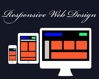
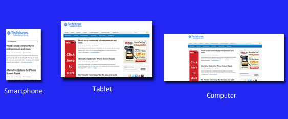
Responsive Web Designing is to design a website theme or template which is suitable for multiple screens no matter you are accessing site on your pc, tabs e-reader, smartphone, mobile phone etc. Well this is a very important factor now a day’s and for future coming since web surfing or internet usage is no more limited to desktops or laptops and it had spread to many mobile devices which can connect to internet.

Why is this important to consider?
Even though your website or blog look great on desktop or laptop, it may not be the same case when it comes to Tabs, Smartphones or any other similar device. By adopting RWD you can make your site perfectly compatible for any devices. You don’t have to have multiple designs for multiple platforms whose setup and maintenance is not an easy task.
Advantages of having RWD:
- Google officially recommends this; which means RWD is good for website’s SEO (search rankings) as each page on your website will have a single URL and thus Google juice is preserved.
- No need to maintain different websites or designs for different platforms.
- More accurate Google Analytics reports since webpage loads seamlessly on any platforms.
- Less maintenance since it’s all in one design.
Conclusion: Well if you planning for a change then it’s are the right time to think about RWD.
Do comment and don’t forget subscribe. 🙂
Subscribe To Get FREE Tutorials!
