Apple INC was formed way back in 1976. From there it has grown such huge that company has changed many of its style and introduced world different technologies which many have imitated and still doing. When it comes to logos also Apple has made many changes, well not so frequent but yet remarkable. In this post I will show (in images) a bit about history of Apple logos.
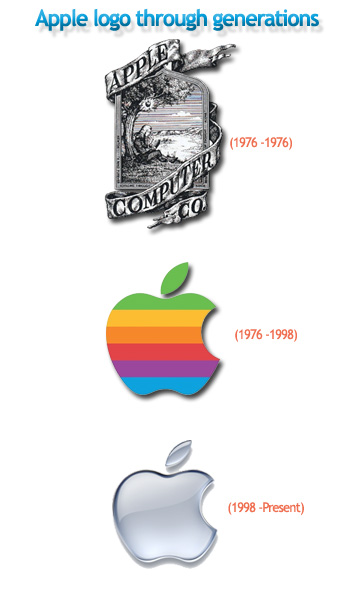
Apple logos have changed 3 times basically. First Apple logo (1976) was designed by Ronald Wayne (co-founder) was depicting image of Sir Isaac Newton siting below Apple orchard tree and with outer phrase “Newton… A Mind Forever Voyaging Through Strange Seas of Thought … Alone.”
Same year Steve Jobs (Founder) commissioned another logo which was Apple logo with a cut on Apple and with rainbow strips as color. The cut over the Apple was to show public that it is Apple and not a tomato. It remained Apple logo (1976 -1998) for 22 years and then underwent a change on the year 1998.
In the 1998 Apple decided to change the color and the looks slightly making it monochrome and with slight embossment. It’s simply because logos on the Apple devices won’t look good with previous rainbow styled logo whereas monochrome with embossed design gives a great look. Apple commissioned new logo 1998 which continues till today.
Below image shows how it has changed through years.

Hope you liked it.Your comments are valuable, so do comment.

