Google has unveiled new style of its Google Images, but sadly it has not made anyone happy. Lot people have made their concerns about it.
Previous Google images were accepted by all members.
Some annoying features (as reported by users):
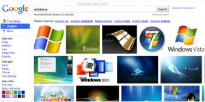
- Endless scroll (many many results)-When you search for any image it gives you results but the thing is its keep on updating and may go down up to 30 pages, thus making not suitable for low speed net connections .For example just search for ‘windows’ in the search bar,you will get enormous amount of results and it will give a 30 page result all which begins from starting and to end. Just take a look. So that means if you don’t have a good speedy internet connection it may really make a mess of your search.
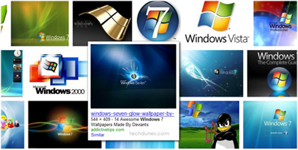
- No information on the result page. If you search for any stuffs you will get whole result arranged in unevenly manner. For getting the details of the image you need to move your mouse over the image and then its pops up with details, very uncomfortable manner.
- Whole page looks messy. Results displayed and images arranged are in just uneven manner. No good formatting of pages ad old Google image result. At a glance the web results looks as if some has just thrown lot of images on page (poor coding).
Conclusion: The new Google Images has unfortunately not up to the mark, it’s just made a lot of confusion for users. I hope Google reads this and does something out of it because its visitors and viewers which has made no 1.


